Custom colours
What you learn
You're instantiating DIVA Player in your web front-end and relying on third party video streaming source.
The goal of this article is to build the simplest front-end to stream a video from your video production applying custom colors to the DIVA Player graphic assets.
Before starting
- Ensure the video production you rely on is up and running.
- Ask your video engineers team
<videoId>,<settingsURL>,<languageCountryCode>,<userToken>and<sharedKey>. - Ensure the setting contains the
coloursfields.
Color customization
DIVA Player allows customizing the following graphic assets:
- Base colors
- Control bar color
- Data panels/Overlays colors
Without customization, all graphic assets above have color #CF030B.
Base colors
In the settings colours section, properties base2 and base3 allow customizing color for
- Buttons
- Progress bars
- Highlights
  "setting": {
          "colours": {
              "base2": "#0f4698",
              "base3": "#0f4698",
          }
  }
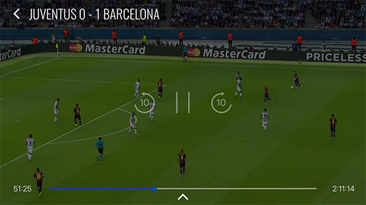
Base color Demo > #0f4698
Control bar
In the settings colours section, properties controlbarProgressBarBg and chromecastProgressBarBg allow customizing color for control bars.
  "setting": {
          "colours": {
              "controlbarProgressBarBg": "#EEE60C",
              "chromecastProgressBarBg": "#EEE60C",
          }
  }
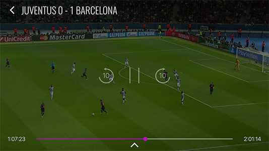
Control bar Demo > #b410b6
Data panels / Overlays
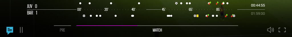
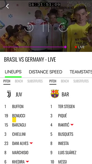
What is the main overlay area
"Overlay" refers to the entire white-background area that covers the main content and provides additional information related to the video content. The overlay area has two main sections:
-
Main Overlay panel: It displays the video title and does not include any other interactive elements or tabs.
-
Overlay Tabs panel: It displays sub-sections that provide additional content. The available tabs may include:
- Video Lists: It displays a list of videos related to the current content.
- Commentary: It shows commentary or discussion related to the video.
- Data: It presents data and statistics related to the video content.
- Ecommerce: It provides options for purchasing products or services related to the video.
Customizable graphic assets
In the settings colours section, the following properties allows customizing the main overlay area:
- overlayBackgroundColor: It sets the background color for both the Main Overlay and the Overlay Tabs.
- overlayTextColor: It defines the color of the text within the overlay area, ensuring readability and consistency with the overall design.
- overlayHighlightBackgroundColor: It determines the background color used to highlight or identify the selected item within the Overlay Tabs.
 "setting": {
         "colours": {
             "overlayBackgroundColor": "#000000",
             "overlayTextColor": "#FF0000",
             "overlayHighlightBackgroundColor": "#FFFF00",
         }
 }
Non-customizable graphic assets
Not all graphic assets are customizable. The following ones are hard-coded:
- External Overlays: Any hard-coded colors that originate from external overlays (e.g., colors used in the Ecommerce tab provided by third-party integrations).
- Tab Selection Color: The color used to indicate the selected tab within the Overlay Tabs.
Highlights / Highlights Top Bar
 "setting": {
         "colours": {
             "overlayHighlightFg": "#ff0000",
             "overlayHighlightFgLight": "#00ff00",
             "overlayHighlightFgLight": "#C6FF00",
         }
 }
Overlay Highlight Demo > #00ff00
Highlights Top Bar Demo > #C6FF00
Alerts
 "setting": {
         "colours": {
             "alertHighlightFg": "#00ff00",
         }
 }
Alert overlay Demo > #00ff00
Errors ????
Buttons
 "setting": {
         "colours": {
             "settingBtnBg": "#009f75",
         }
 }
Setting Button Background Demo > #009f75
Instantiation
There's no code to add to the Basic instantiation code.